Okay, I’m exaggerating slightly. The plugin exists. It’s public, and you can install it right now. It just never became what we had in mind.
I’ve finished my time at Kido, so I’ve been looking back at what I built there. For much of the first two years, I was trying to save designers from writing component documentation by hand.
The problem, 2022
Four years ago, handoff from designers to developers was a big problem for us. I think it still is, but at least now there’s Figma Dev Mode and a pile of other tools. Back then, we hadn’t found much that helped. There was the Redlines plugin, which did something, but nowhere near enough for what we needed.
Design systems were one of Kido’s main products. A system could have fifty or more components, each needing documentation: dimensions, spacings, labels for every element. Preparing all of that took designers days. It seemed like an obvious thing to automate.
Version one
The first version was a simple plugin with an ugly interface. It did enough to be useful.
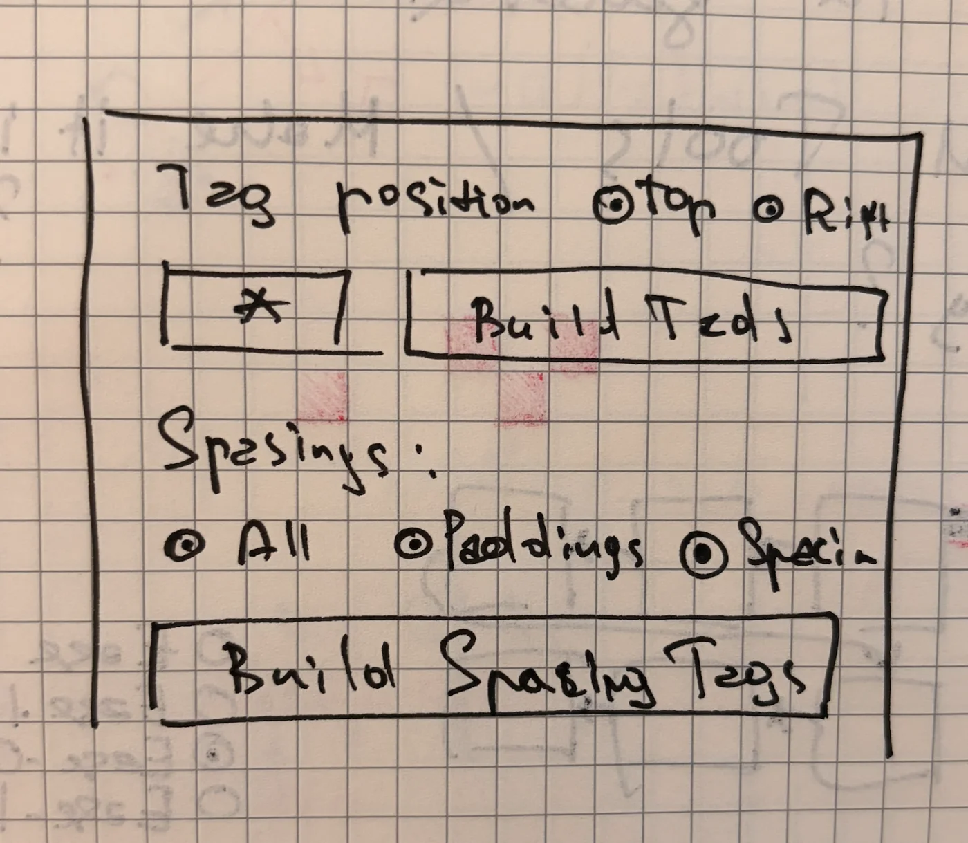
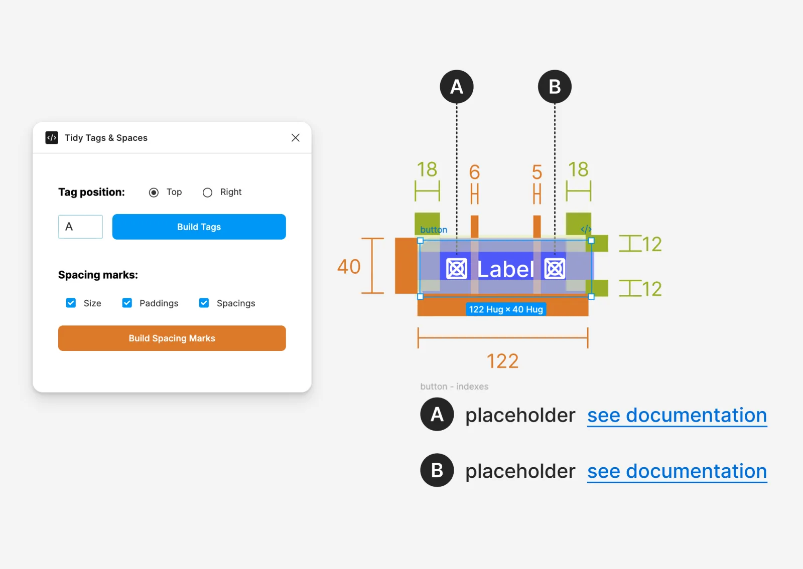
This version only picked up component instances. Text elements were invisible to it.
The page that shouldn’t have existed
Those labels and spacing markers had to come from somewhere.
From my own pain and sorrow: the internal tools page. I invented it and then regretted it for about two years. The designers, though, loved it.
We added it as the last page of every design system file. Its name, and I am not inventing this, was:
🧨 .DO NOT TOUCH!!! - internal tools
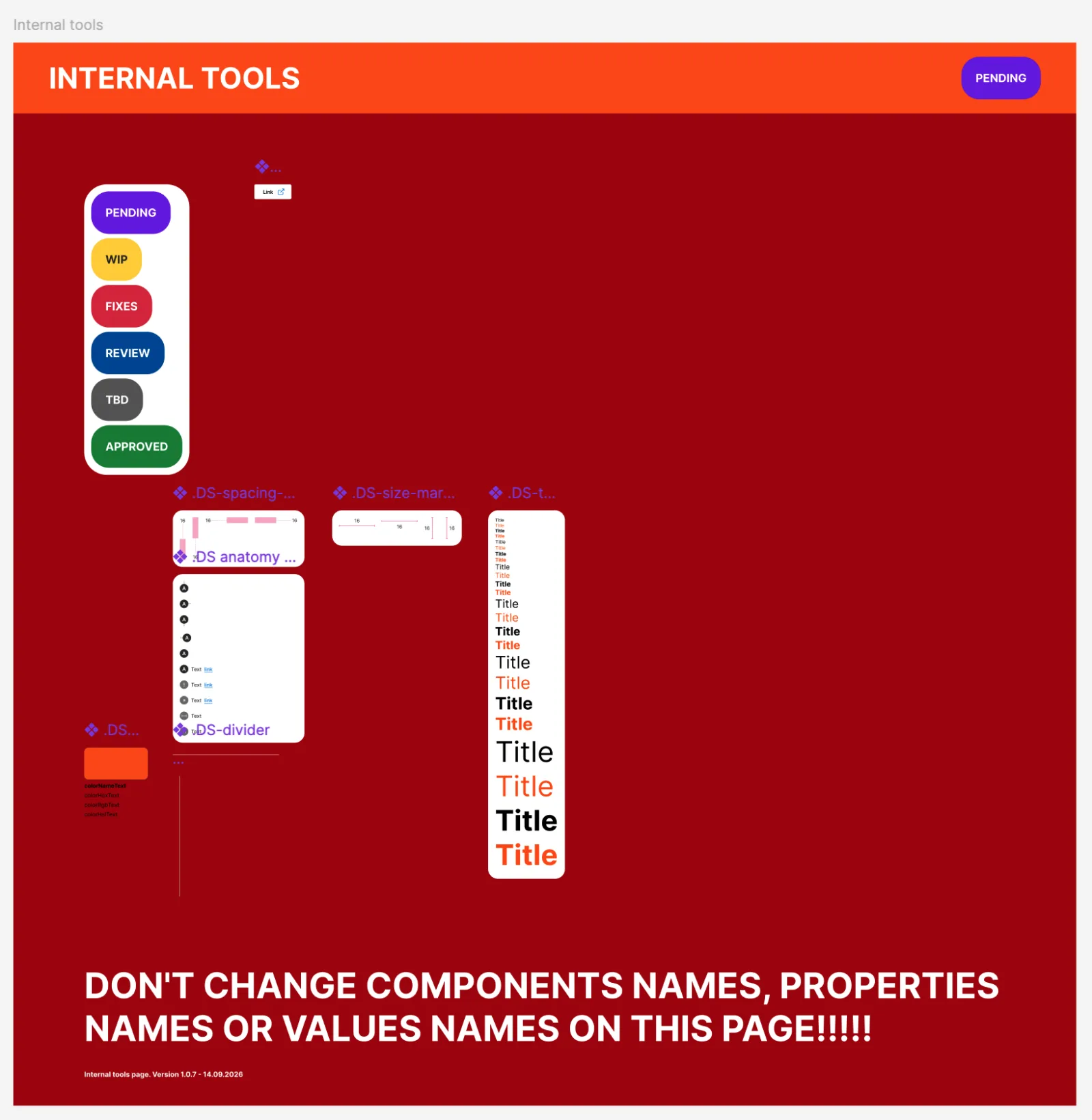
I can see why they liked it. The markers were ordinary Figma components, so designers could change the colours, fonts and some of the shapes to match the system they were documenting. They could do it themselves, without waiting for me to add a setting to the plugin.
The trouble was that the plugin depended on those components being built a particular way, and any designer could edit them. Someone would rename a layer, a function would go looking for it by name, and the plugin would fall over. Or the whole page would be missing. There were plenty of possibilities.
By my rough count, about 95 per cent of reported crashes came back to that page. I’d made the tooling easy to customise without making it safe to customise. Then I spent two years dealing with the results.
Hence the red background and the five exclamation marks. Somewhere between the second and third, I probably should have tried something other than shouting at the user. In fairness to the shouting, it did work for a while.
When the page was missing, this was about as helpful as the first version got:
figma.notify(
  'to use this plugin, please, add "🧨 .DO NOT TOUCH!!! - internal tools" page to this project'
);
figma.closePlugin();
It asked the designer to fix it and quit. Some lookups didn’t even check whether the page existed before trying to read its contents. Those just threw an error.
So I added checks and repair routines, eventually running them before each action because the page could change between clicks. By the second generation, the plugin would rename the existing page to working, build a fresh reference page from code, compare the two by child names and copy over any missing tools. Then it deleted the temporary page and put the old name back.
I had written a dependency manager for a page in a design file.
It worked, at the cost of more code and more waiting. I eventually got rid of the page altogether, but first there were several more versions of the plugin to build.
Version two: Tidy Auto Docs
The next version was part of a set of plugins we called Tidy Auto Docs.
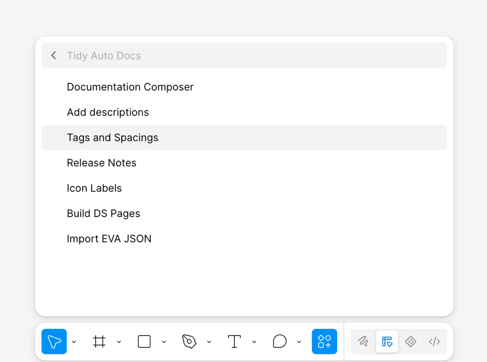
“Tags and spaces” had also become “tags and spacings” somewhere along the way.
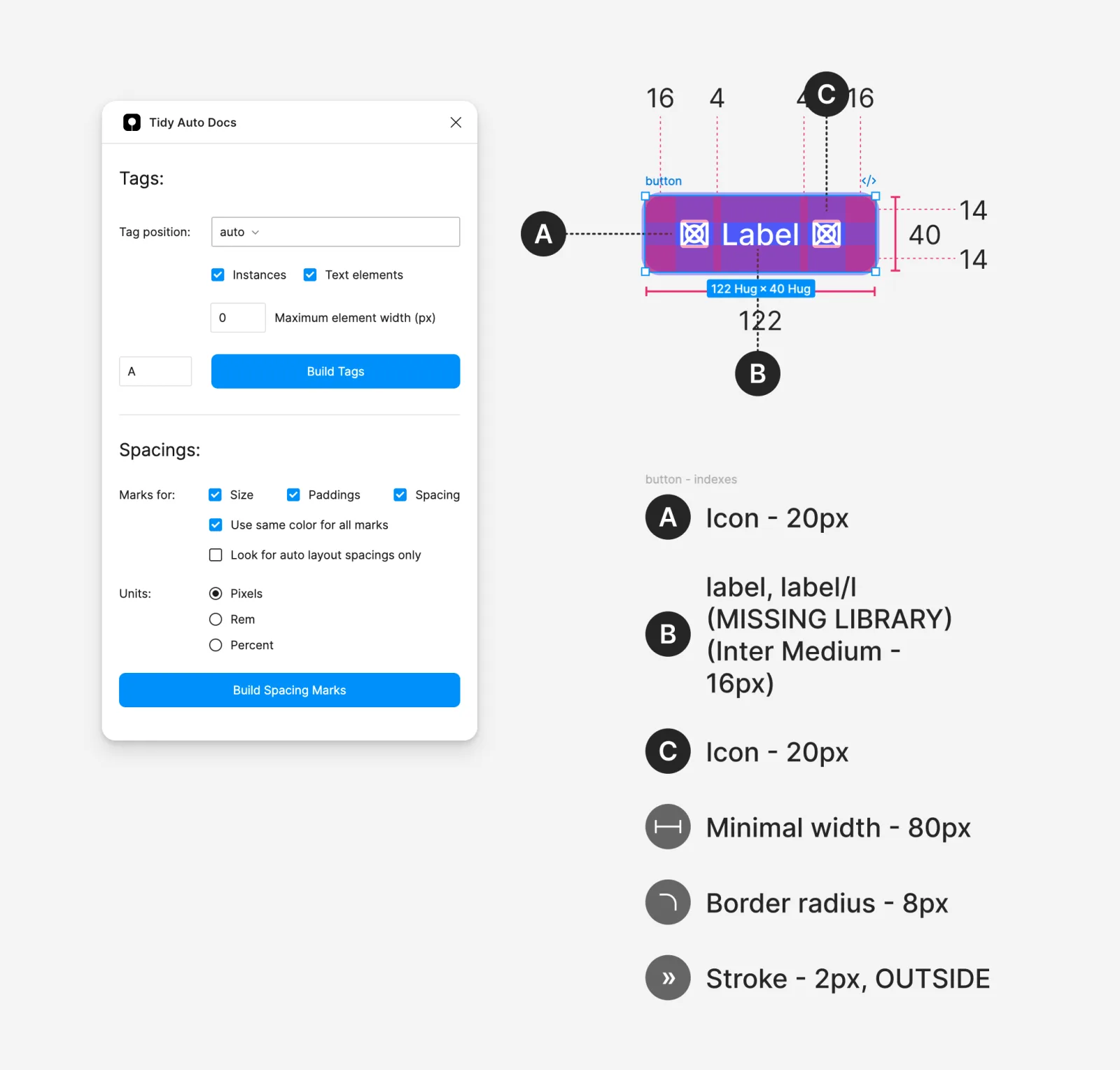
The interface was more usable now. Still no masterpiece, but you could choose units for spacings, and the plugin finally recognised text elements. It was getting closer to the tool we ended up with.
The same set included Documentation Composer, our first attempt to generate a whole documentation page automatically. It used the same tags and spacings, but added do’s and don’ts, release notes, and a grid of the component’s variants.
There was also a PDF export feature. It cloned the documentation and rearranged it into page-sized frames inside Figma, ready to export. By July 2023 I’d moved it into the archive, in a commit called cleaning. It worked. Nobody used it.
The very nice animation is by Shaked Shay and Noi (NOiNA) Navve. Shaked also designed the canvas layout.
And then Specs happened
EightShapes Specs, by Nathan Curtis, was announced on 13 February 2023. It did roughly the same job as ours, looked better, and was publicly available. Ours was still strictly internal.
The frustrating part is how much we already had working. The older repository has a documentation builder committed as mostly working for docs in September 2022. We added rem conversion in December and variants in January. Our dos and donts added commit is dated 26 February 2023, two weeks after the Specs announcement. We’d been building much of the same functionality for months.
What we didn’t have was design. The thing worked and it was ugly.
And we were a design studio. Publishing an ugly tool with our name on it was out of the question. We barely wanted to use it ourselves looking like that. So this version never made it to the Figma Community. We were invisible for the one reason we were least entitled to be.
I still think we paid too much for that standard. We spent months polishing an interface while a working tool sat unpublished. This was before we were using AI to write code; every UI iteration took days of somebody’s time. My CEOs and I disagreed about whether that was worth it. I still disagree.
Meanwhile, our plans for the project were getting bigger.
Autumn 2023: something big
Our two co-CEOs, Ido Zaifman and Karen Segev, wanted to turn this into a bigger product. I decided what to build.
We wanted people to be able to read the documentation in a browser, without opening Figma or losing any of the graphics.
That became three separate pieces: a Builder to create documentation, a Viewer to read it inside a plugin window, and a website where you could log in and read the same documents. The Viewer and the site loaded documents from the backend, so there was no separate export to maintain.
The Builder exported frames as SVG, keeping text as text rather than converting it to outlines. The drawings stayed sharp in the browser, even when you zoomed in.
The Builder also stored each component’s key so it could re-import the component when rebuilding its documentation in another file, provided you had access to the library.
Naturally, this meant accounts. Users belonged to companies, documents were organised into collections, and we had Admin, Editor and Viewer roles, plus permissions for individual collections. I even built password reset. All this so someone could read about a button.
Documents could now contain text, lists, links, images and video alongside the information extracted from components. On the canvas, a video appeared as a link; inside the plugin, it played. You could also choose which sections to build: just anatomy, for example, or a variant grid with a different selection of properties. We ended up with ten section types.
This is also where the internal tools page finally died. The Builder created every tag, label, line and marker in code. Designers could still customise the appearance, but through settings and a colour picker inside the plugin. Changing a colour no longer gave you the opportunity to accidentally rename something the code depended on.
I built the whole backend. Everything else I built with Adir Slutzki, my main partner at Kido for years. We had a routine: I’d make an ugly interface with all the logic working, including sorting, reordering, adding and deleting. Then it would get a proper design, and Adir would implement it. He has more commits across the Builder, Viewer and site than I do, mostly on the UI.
After all that, the plugin was slow and cumbersome. It was reliable enough, but I didn’t enjoy using it.
I don’t have any screenshots from that period, and the server has been dead for a long time. Visually, though, it wasn’t far from what came next.
Tidy Guide Lite
At some point I’d had enough and wanted to go back to the original idea.
Everyone was reading the documentation on the Figma canvas anyway. The accounts, permissions and website had added a lot of work without helping the people actually using the tool. I wanted to keep the documentation features, get rid of the backend that managed the documents, and make the plugin quick to use. You still needed to be able to save your work and rebuild it later.
Lite saves the documentation data inside the Figma file itself, on the document root. Another designer can open the file with the plugin and rebuild the documentation, even if it’s been deleted from the canvas. No account with us required. I still like that part.
There are still a few external services: images live in remote storage, and video details come from the YouTube API. But the accounts, collections, permissions and document server were gone. The plugin was much nicer to use without them.
UI design and canvas layout: Sandra Ben Yehuda. UI implementation: Adir Slutzki.
We published Lite under the original product’s Figma Community listing. That’s the version you can install.
The ending nobody noticed
In September 2024 I added AI generation for do’s and don’ts and text sections. We tested it, shipped it, and people liked it.
There were a few more changes after that, but we stopped developing it much further. People kept using the plugin. Nobody picked up the AI feature again, including me, and I forgot it was there until I opened the source to write this article. Somehow I managed to forget an AI feature for two years while the entire industry talked about very little else.
The last development commit before this article was in December 2024.
So what now?
Honestly, I don’t know. To record these clips, I first had to get an agent to repair the old plugins: dead APIs, deprecated modules, dependencies that no longer resolved. The oldest version wouldn’t start at all.
By then, this particular handoff problem had become less urgent for us. With Dev Mode available, there was less reason to keep working on our own tool. Now I’m building for coding agents too, which changes what I want from documentation. A nicely laid-out page on the Figma canvas is useful to a designer. An agent needs to be able to get at the information in it.
In the next plugin, agents build the documentation themselves. I’ll write about that separately.
Repositories